Role: UX Manager (Credit Card and Bank Servicing Platforms)
Goals and Involvement:
- Keep visual brand styling intact
- Consolidate more authenticated features into Customer Authenticated Badge section
- Increase Search visibility
- UX design (graphical wireframes, low fidelity mockups, high fidelity prototyping)
- UX team management
- Cross team collaboration/management
How do you make an online customer experience better, when the feedback you receive is already positive?
Easy, just…keep…it…simple.
Why simple? Why not more complex, because “If it’s intuitive, the customer will immediately pick up on the changes you implemented.”?
There are a number of answers to this, but in the case of Capital One Financial’s Credit Card Servicing platform, the personas/demographics indicated customers are resistant to big/vast changes to the UI and/or other visual elements within the servicing platforms themselves.
In leading the team of front end designers and developers charged with prototyping the UI/UX of the credit card servicing site for Capital One, the greatest challenge was balancing the needs/wants of the business versus being an advocate for the customer and the feedback we receive through user testing/moderated testing.
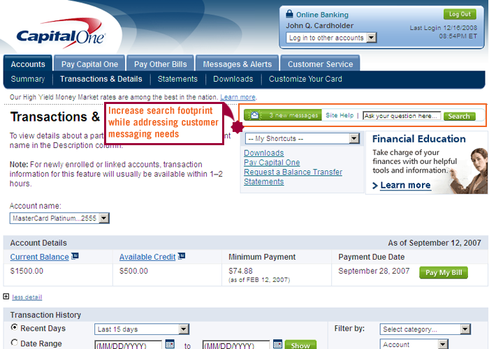
One project I led was the integration of better search and messaging placements. This was just one of many wins I had with the design team.
The old layout
Updated placements
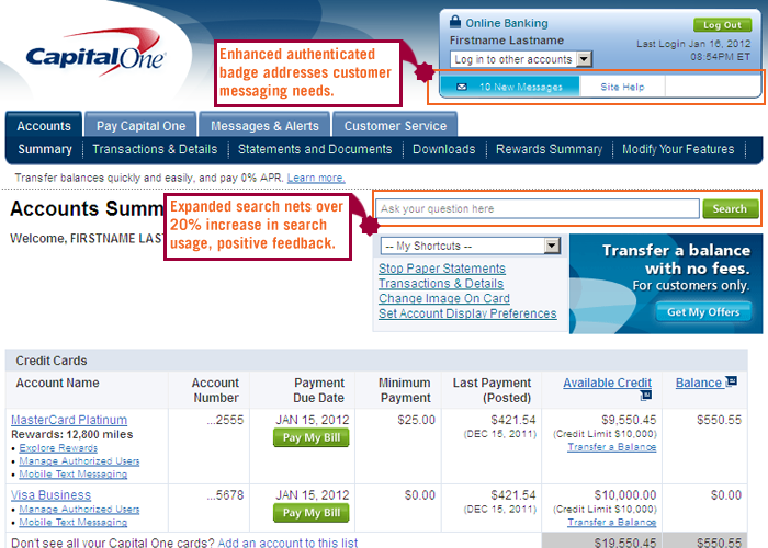
The end result was increased visibility of messaging to customers as well as an uptick in search usage with the expanded footprint of the UI for search.
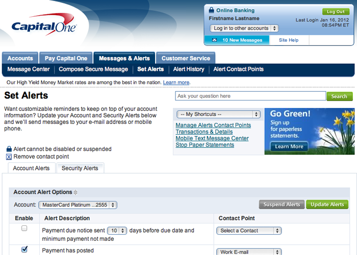
Additional Features integrated into credit card servicing platform
In rolling out this new feature (Text Alerts) to Capital One credit card customers, the use of capturing additional contact points/information became more prevalent. Furthermore, integration of visual calls to action were carefully noted (gray for secondary action, green for primary).